

How to Use CSS Media Queries in React Components

I help product teams build quality software and lead engineering efforts. Currently working at OpenSpace as a Senior Software Engineer.
We want our web applications to be accessible on various devices. With CSS, we can address layout and styling changes between various screen sizes. But with what web applications are capable of now in general, you might want control over more than just how things look. 🔨
In this article, you will learn how to adjust functionality based on the current viewport size in your React components.
Styling
Let's first take a look at a simple example of adjusting styles with CSS Media Queries. We will have a single element that changes color based on the viewport size.
.responsive-box {
  height: 16px;
  border-radius: 8px;
  background-color: aquamarine;
}

@media (min-width: 800px) {
  .responsive-box {
    background-color: dodgerblue;
  }
}

@media (min-width: 1200px) {
  .responsive-box {
    background-color: blueviolet;
  }
}
As you see, we defined two breakpoints - 800px for medium-sized devices and 1200px for larger ones. We should get the following result when changing the viewport size.
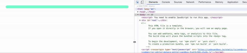
Great! With that out of the way, let's see how this translates to JavaScript.
Functionality
Oftentimes, you might want to change how the application behaves based on the current device size - like a simplified experience on mobile devices and a richer one on desktops.
Let's assume that in our example we want a different text to show up based on the viewport size. One for small devices, other for medium ones, and another for the largest. With your CSS skills, you might think - "I'll just render three components and only show one of them, using CSS Media Queries!". This might be fine, but in some cases e.g. conditionally loading code for a given viewport, this is not enough. Let's do it with JavaScript only.
Match Media API
Browser gives us the functionality we need with window.matchMedia() API. For a given media query, such as (min-width: 800px), it gets us a MediaQueryList object. It allows you to do the following.
- Get media query status - whether the query matches the current viewport.
- Subscribe to the changes of media query status.
With that, it should be possible to build a hook that lets us know whether a given query matches the current viewport. Let's do that.
Building a hook
First, we accept a query string and create a media query object. We also need a state to keep the return value.
function useMediaQuery(query: string) {
  const mediaQuery = useMemo(() => window.matchMedia(query), [query]);
  const [match, setMatch] = useState(mediaQuery.matches);

  return match;
}
Now, let's subscribe to the media query status changes and update our state when a change happens. Let's add an effect.
function useMediaQuery(query: string) {
  const mediaQuery = useMemo(() => window.matchMedia(query), [query]);
  const [match, setMatch] = useState(mediaQuery.matches);

  useEffect(() => {
    const onChange = () => setMatch(mediaQuery.matches);
    mediaQuery.addEventListener("change", onChange);

    return () => mediaQuery.removeEventListener("change", onChange);
  }, [mediaQuery]);

  return match;
}
And that's it! We've got our hook ready to go. 🏁
Exposing your application's breakpoints
The hook above will work for any media query string. In our example we have two breakpoints - we need to know when we hit medium size and when we hit large size. Let's build another custom hook that will get us all of this.
function useMediaQueries() {
  const md = useMediaQuery("(min-width: 800px)");
  const lg = useMediaQuery("(min-width: 1200px)");

  return { md, lg };
}
Using our hook
Once we have the hooks defined, building a responsive component should be straightforward. We can implement what we want as follows.
function ResponsiveComponent() {
  const { md, lg } = useMediaQueries();

  if (lg) {
    return <p>Desktop device</p>;
  }
  if (md) {
    return <p>Tablet device</p>;
  }
  return <p>Mobile device</p>;
}
Let's see how it works.
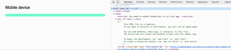
You can see the full example in CodeSanbox. As you see, both the text and the styled element change when we hit our breakpoints. That's exactly what we wanted, sweet! 👌
Keeping things in sync
All works great, but there's one thing that we could improve. I bet you spotted this as well. Our queries are defined twice - in CSS and JavaScript. Nothing is tying these two definitions together. There's no guarantee that when we decide that 1200px is too little to already flip the layout to desktop, we'll remember to do it in two places. 🙃 No good.
Let's look at how we might tie these two together.
Native browser mechanisms
...unfortunately won't solve this problem for us. Even though browsers give us a way to share data between CSS and JavaScript - CSS Variables, these, unfortunately, can't be used in media query definitions. 😞
:root {
  --md-breakpoint: 800px;
}

/* ❌ This won't work */
@media (min-width: var(--md-breakpoint)) { ... }
CSS variables are always tied to some HTML element, while media queries are processed independently from the DOM. There's a proposal to introduce CSS environment variables that might fill this gap. Ben Holmes has a more in-depth article on this very topic.
Different styling approach
Taking an alternative approach to styling might lead to eliminating this problem. As an example, let's look at Stitches, a CSS-in-JS library. The styles here are generated based on JavaScript code, so there's no syncing to do. Everything is available in the application code.
/* Shared configuration */
const { styled, config } = createStitches({
  theme: { ... },
  media: {
    md: "(min-width: 800px)",
    lg: "(min-width: 1200px)"
  }
});

/**
 * Component styled based on CSS Media Queries
 * Usage: <ResponsiveBox md={{ "@md": true }} lg={{ "@lg": true }} />
 */
const ResponsiveBox = styled("div", {
  height: "16px",
  borderRadius: "8px",
  backgroundColor: "aquamarine",

  variants: {
    md: {
      true: {
        backgroundColor: "dodgerblue"
      }
    },
    lg: {
      true: {
        backgroundColor: "blueviolet"
      }
    }
  }
});

/**
 * Hook adjusted to used shared media query definitions
 */
function useMediaQueries() {
  const md = useMediaQuery(config.media.md);
  const lg = useMediaQuery(config.media.lg);

  return { md, lg };
}
As I said, this isn't necessarily a solution to this problem but an alternative approach that makes it obsolete.
Conclusion
To summarise, we went over how to adjust both your React application styles and behavior based on the current viewport size. For that, browsers give us the two following APIs.
- CSS Media Queries
- JavaScript Match Media API
Since it is native browser functionality, it works regardless of the framework or styling solution. I hope you find this useful and that it will help you build even better responsive applications. 💪 Good luck!
If you liked the article or you have a question, feel free to reach out to me on twitter or add a comment below!
Further reading and references
- Full code available in this CodeSandbox
- Photo by AbsolutVision on Unsplash