
Design for Developers: Part 2 - Design Principles

I help product teams build quality software and lead engineering efforts. Currently working at OpenSpace as a Senior Software Engineer.
As with every topic, to truly understand it, the best way is to start with the basics. There's no single, unified list of designed principles, although the lists that do exist have at least some elements in common.
This is the second article out of 4-part series called Design for Developers. It covers design principles that are the most fundamental, in my opinion, and should give you enough insight to consume or create web design more consciously.
Contrast
Contrast refers to how different two or more elements are, especially those in close proximity. The most common case when we use this term is when talking about colour. But in the definition, there's nothing that limits the notion of contrast to this dimension. We can refer to contrast when talking about differences in size, shape or even position.
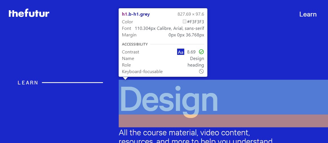
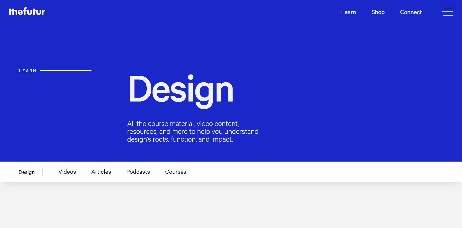 Screenshot from The Futur website
Here's an example of a website that has at least a few examples of high contrast. The first is colour (white text on a blue background and black text on a white background), the other is the font-size difference between the main header and paragraph below.
In general, the more different the two elements are, the higher the contrast. For text elements, Google Chrome with Inspect tool gives you a numeric measurement of contrast.
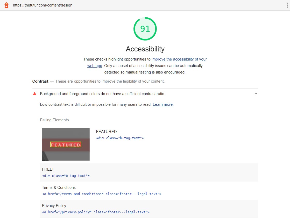
In practice, the contrast helps to differentiate elements from the background, whether that's text or elements like button. To know what's the minimum contrast from an accessibility perspective, yet again, Google Chrome has got you covered. You can use Lighthouse Accessibility Audit which gives information on elements with insufficient contrast.
Balance
Next up - balance. Each element in the design carries a certain weight. It's a direct effect of the size, colour (and contrast, for that matter) or position that the element has. The higher the weight, the more the element draws attention. The idea behind balance is to distribute this weight across the design more or less evenly.
Balance is not the same as symmetry, although it can be achieved using a symmetric layout, like in the design below.
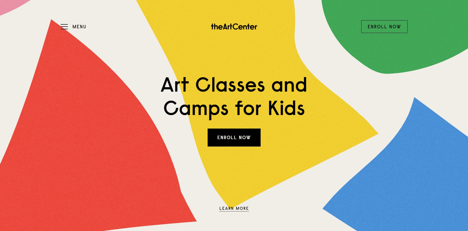 Screenshot from The Art Center website
Here the heaviest elements, which are the header and CTA button are centred. Other lighter elements are evenly spaced to the left and the right side. That way the weight is equally distributed across the screen and that's the reason why this website feels balanced. But you don't have to use symmetric layout to achieve balance.
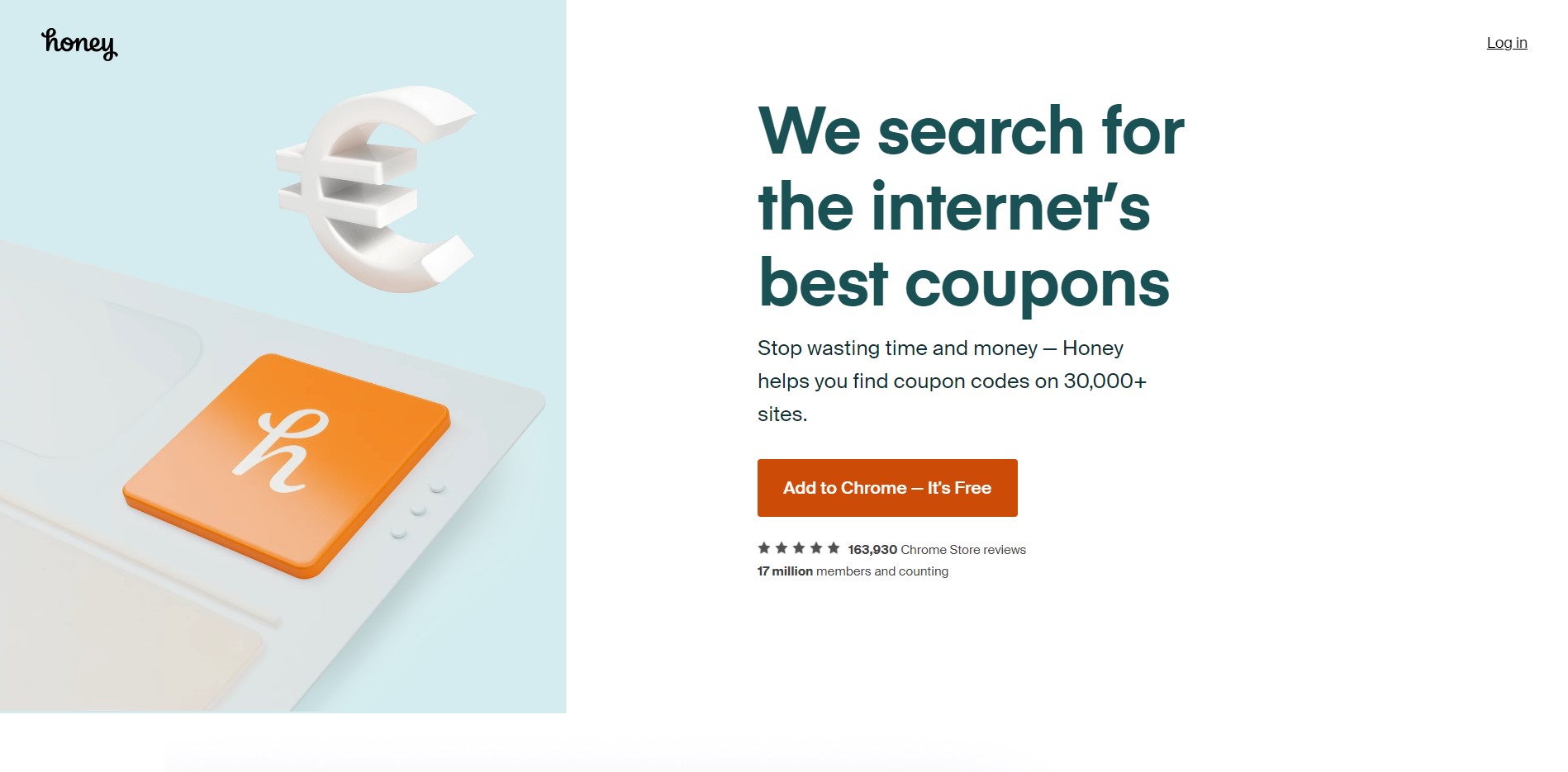 Screenshot from Honey website
This website features an asymmetric layout, but it still feels balanced. The reason for that is that the image, which is the biggest element is slightly offset to the left, leaving more white space around elements that we want to draw attention to - the title, subtitle and CTA. Add the title size and contrasting colour of the CTA button, and all falls in the correct place.
Regardless if you choose a symmetric or asymmetric layout, when designing a website it's worth basing the design on a grid. That way you have some boundaries to work off of, which can be helpful to achieve balance and rhythm.
Emphasis
Broadly speaking, emphasis is a strategy that aims at capturing the viewer's attention and drawing it to a given design element. This also can be achieved in multiple ways - through colour, size or space. Emphasised elements typically have more weight, which we talked about in the previous section, giving a user information on what they should focus.
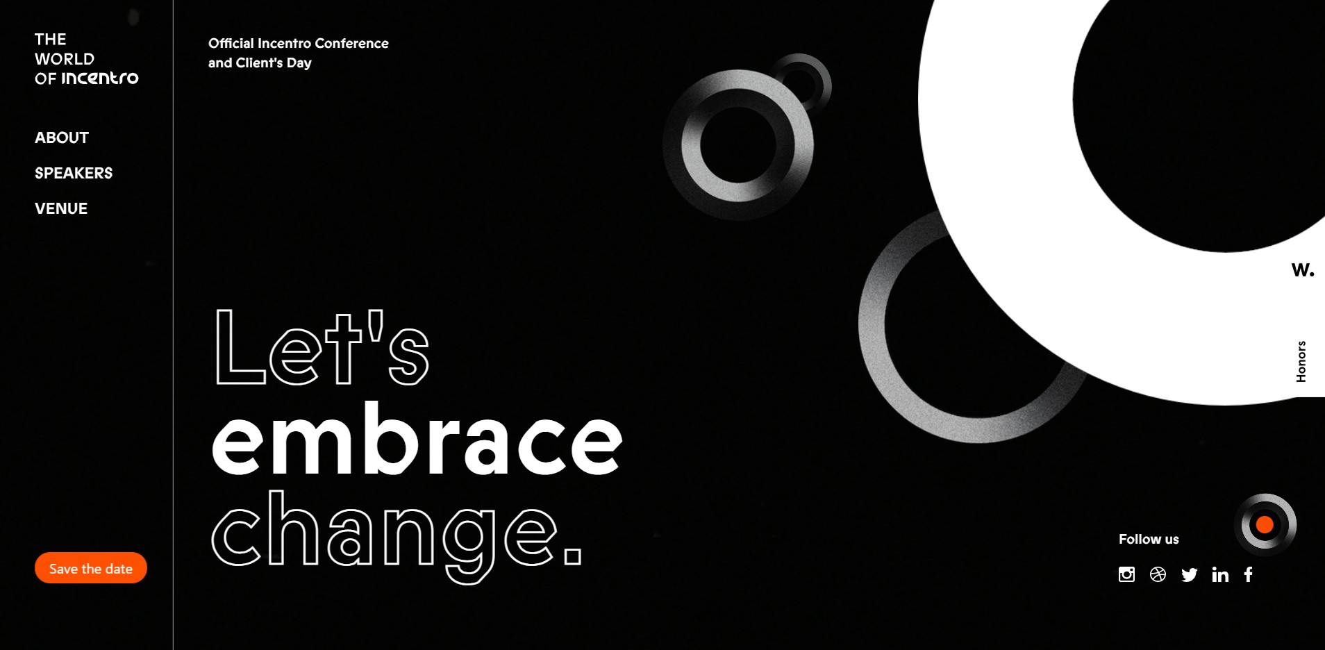 Screenshot from World of Incentro website
In the example design above there's an interesting way of emphasising text. The word embrace in the header is accented using filled text, while other words have just borders around the letters. Another element that is emphasised is the Register now button - despite being small compared to other elements, vibrant red draws anyones' attention.
This design principle is key to having a good user experience - as a rule of thumb, it's recommended to give users single main action that they should take on a current screen. This can be achieved through correct use of emphasis.
Hierarchy
Hierarchy refers to ordering design elements, typically according to their importance, in a way we want the viewer to look at them. It's closely related to emphasis. Emphasis typically applies to a single element, while when we talk about hierarchy, we refer to collections of elements.
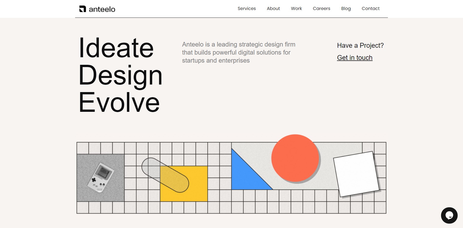 Screenshot from Anteelo website
Let's talk about the hierarchy of text elements in the hero section of the above design. In this example, hierarchy is created through proportion and direction. The title on the left is more important than other elements, so it's significantly larger. Next, there's the less important paragraph, featuring a smaller text. Finally, you land on the elements on the right side, which take the least amount of space, but the text has a bit higher contrast since it's probably more important to the user. All of that creates a hierarchy of these three elements. Finally, the order of the elements indicates how the page should be read (at least in the countries where we read left-to-right), reinforcing the whole concept.
Having a proper hierarchy in the design gives a user a clear path which they should follow using our website or application.
White space
This one's pretty straightforward. White space refers to the area between two elements (which not necessarily have to be of colour white). Even though it's just empty space (or as it's commonly referred to, negative space) it serves a very important purpose in design.
 Screenshot from MAFCOHouse website
Let's look at the example above. First, whitespace around elements allows the design to breathe, makes the website clean and readable. Not every pixel of the website has to be filled. Next, white space is used to group elements together. The header is much closer to the buttons than to the logo. Naturally then, we perceive header and buttons as one group. By grouping elements together, negative space also helps structure hierarchies.
Try to use white space with purpose. It's a great way to group elements or give more weight to the elements that should be of users' interest.
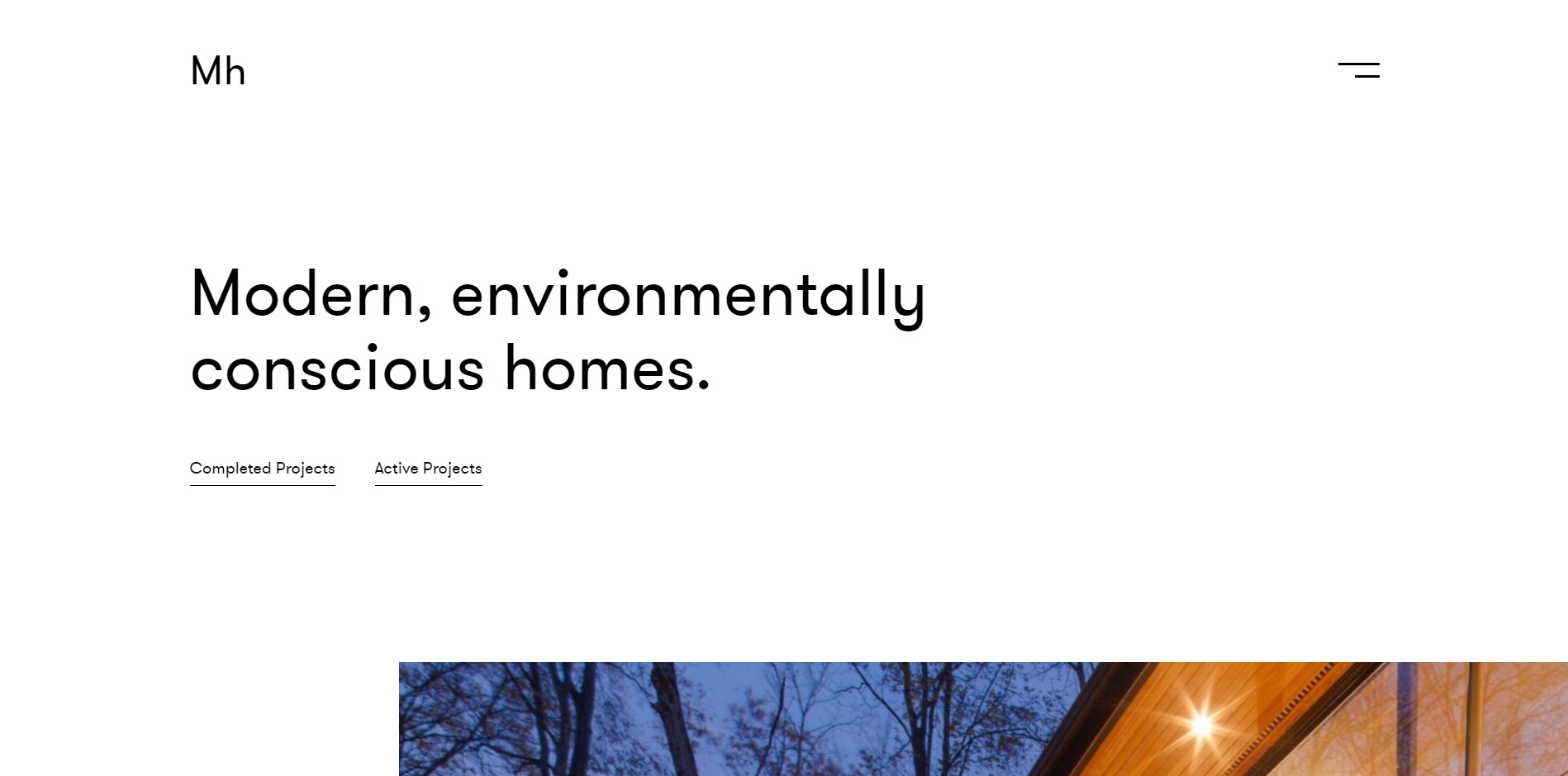
Repetition
Last but definitely not least is repetition. Human brains love familiarity. Repetition is a great tool to give users that sense of unity and thoughtfulness through the design. Let's look at two example screens from the same website.
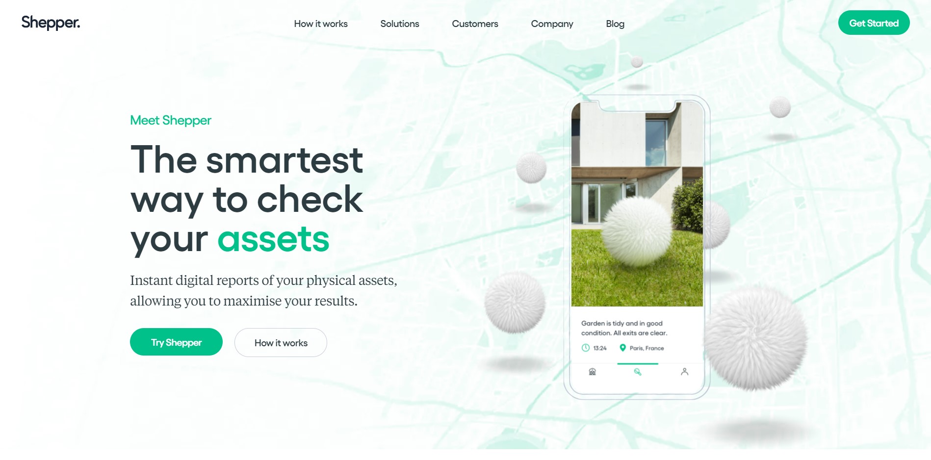
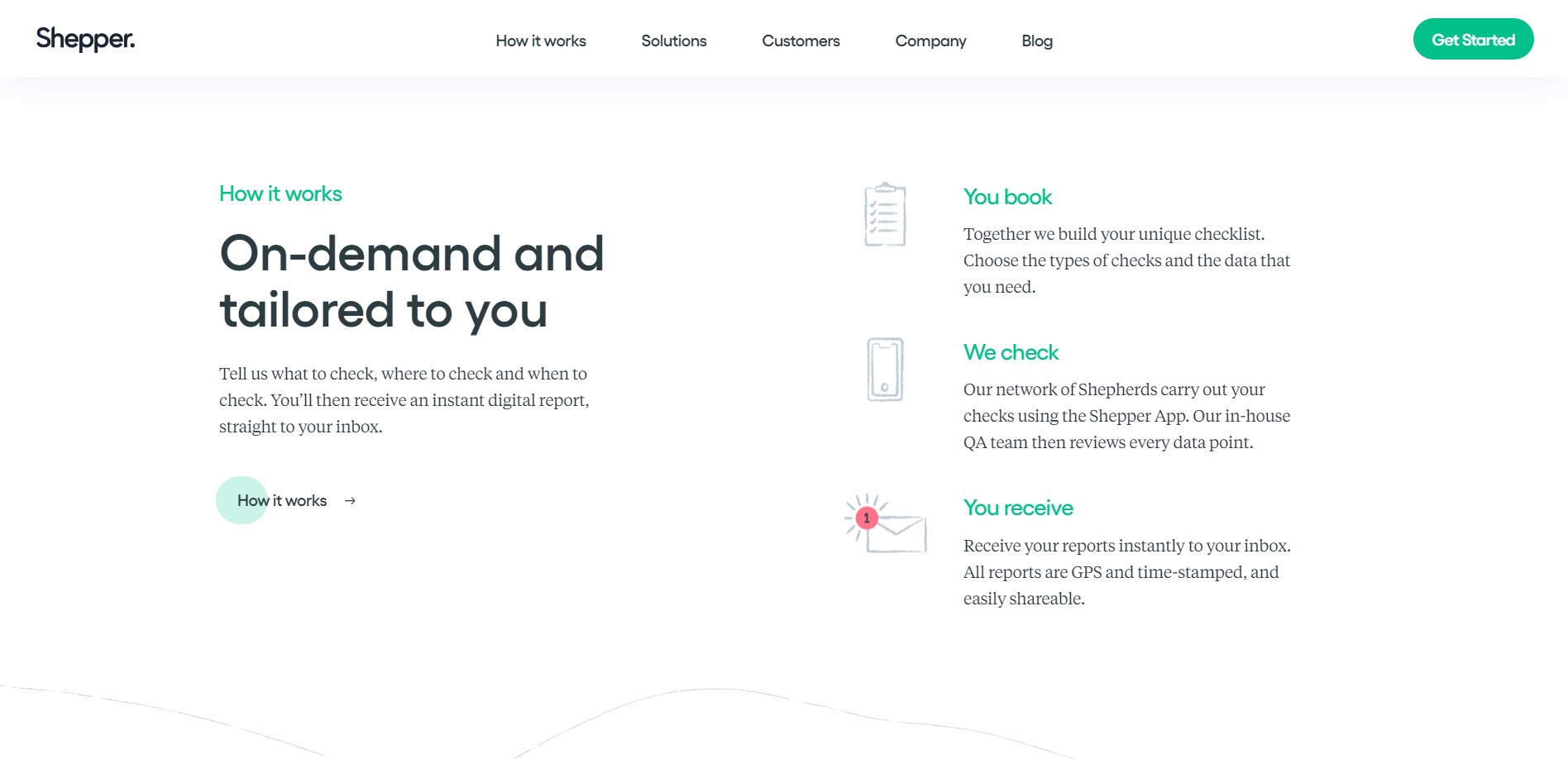
Screenshots from Shepper website
Even though there are different elements, there are also a lot of commonalities. It might be not easy to really see repetition here, so let's organize that a bit differently.
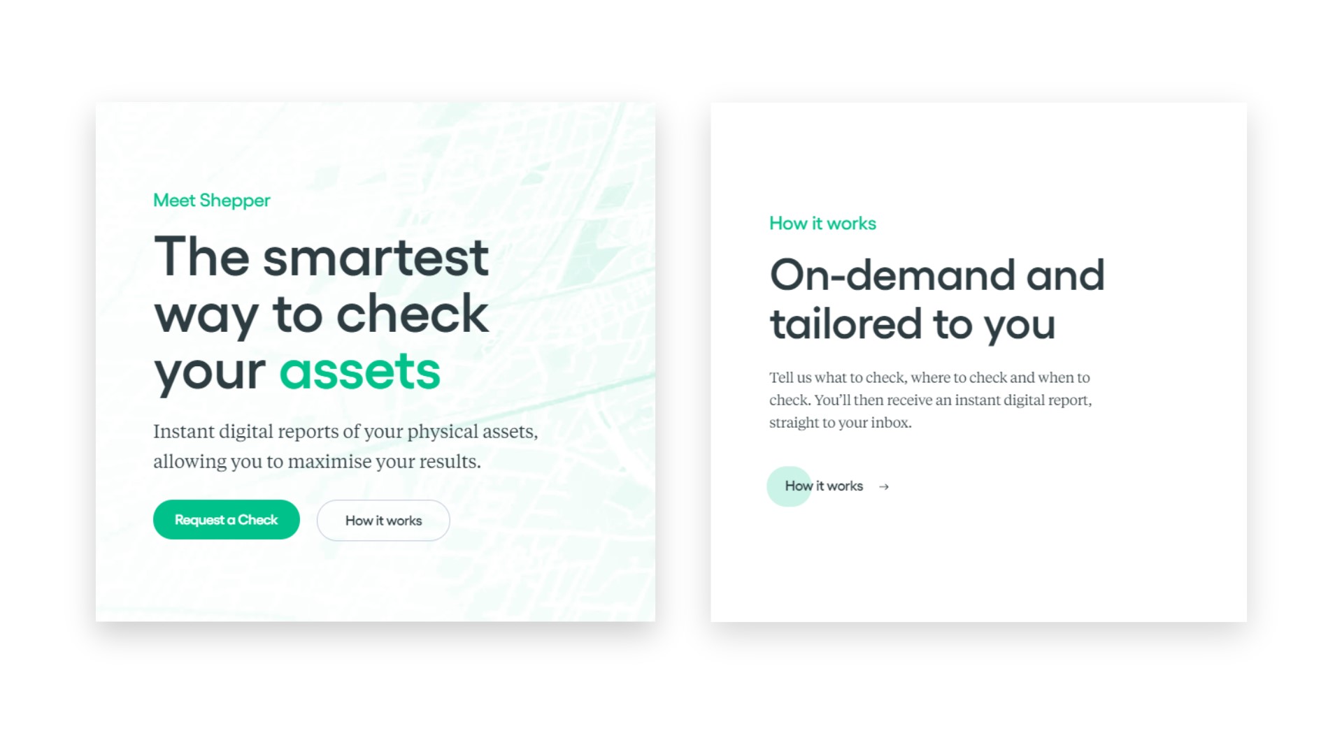
Here we have two examples of entire sections. Both have a pretty similar structure. There's a title, subtitle, text and buttons. The accent colour is used in similar places. Headings use the same font family, different from the paragraphs, but both choices are consistent across the two examples. Finally, even though there are different buttons styles, they share the font family as well as have the same accent colour - those two factors tie the elements together.
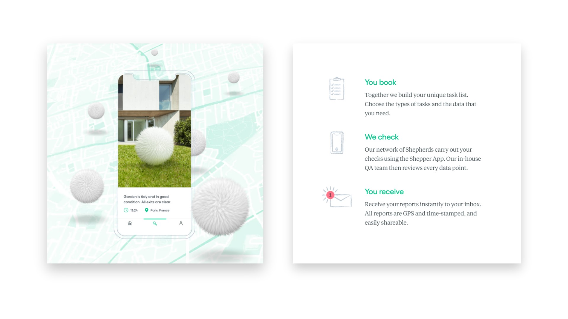
This is an interesting example of consistency that covers not only functional elements but also decorative ones. When we study the illustration on the left side closely we can see that the phone's outline uses the same style and texture as the icons on the right-hand side. Such subtle details really double down on the sense of cohesion.
All of these are examples of repetition and make the user feel that even though elements are different or serve a different purpose, they belong to the same family. This is why creating a strong design system is so important for an application. Choose a font family (or two if you feel adventurous) and a narrow set of colours. Use basic components such as heading, text and button consistently. Stick to one icon set. These simple things can really go a long way.
Conclusion
There are many more design principles we could talk about such as proportion, rhythm or unity. But as you can see, even though we went through six, none of them exists in a void. We cannot talk about hierarchy without mentioning emphasis, repetition or white space. Balance is also closely related to hierarchy or repetition. White space does not exist without other, contrasting elements. All of them combined account for quality design and using them consciously could save you a lot of time and trial and error.
Further reading and references
- Article by Cameron Chapman on The Principles of Design and Their Importance
- Article by Charchit Garg on Principles of Design: the application of contrast and similarity
- Photo by Francesco Ungaro on Unsplash